
The storm over the National Library's logo. The designer of the new logo, Rotem Cohen Soaye, said today in an interview with KAN Culture and responded to the controversy: "People accused me of being anti-Zionist and in favor of a state for all its terrorists."
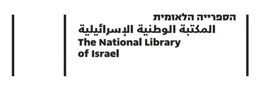
In his explanation, he clarified the process of creating the logo: "It is important to understand that this is not something that Rotem decided or didn't decide on a whim. It's a long process of over a year and a half of deep dialogue and research carried out in collaboration with many individuals in the library, people who truly work with the library day in and day out, who are familiar with its activities, and who understand its graphic language. Towards the move to the new building, there was a desire to refresh the library's graphic language and bring it into the twenty-first century."
The work process in creating the logo
In response to Education Minister Yoav Kisch's letter, in which he questioned the work protocol, Cohen said, "As a graphic designer providing various services to the library over the past five years, I have primarily worked with the Education Department, the Culture Department, and the Visitor Center. Various attempts were made to rebrand the library even before I got involved."

"A situation arose where the proposals submitted from various sources were rejected, and then they turned to me and said that the problem with other designers was that they didn't know what the National Library is, the nature of its activities, and who the target audience is. You know us and work with us."
"We created hundreds of sketches, and we explored numerous directions, some of which were based on the existing logo, and some were based on the new building. In the end, the management team decided on this, and it went through many approvals, generating great excitement towards something new."
The library is not just a place where there are books on the shelf
Regarding the numerous online reactions against the logo, he said, "The logo that everyone mourns its departure was not well-known to most people. In the current era, we decided that it does not suit us for several reasons. The library is not just books; it also includes music and recorded content. It's not just a place with books on the shelf, so we decided to leave behind the logo that mainly featured a book."
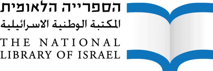
"Another reason is that the well-known logo is based on the typography of the Hebrew University. With the transition to the new building, there was a need to disconnect from the existing typographic language.
"Personally, I am a believer and wear a kippah. You cannot accuse me of being anti-Zionist. We are in crazy times in a country where the strong dominate. If something is not clear, people can interpret it in various ways, and unfortunately, they chose to interpret it in very sad directions that do not allow for cultural discourse."
Regarding the decision to withdraw the new logo, Cohen said: "I completely understand their decision. The public reaction was so intense that I understand why they did it. I think they didn't have to do it, but I completely understand and respect their decision."








0 Comments